
Slutresultatet på varje sida i en och samma bild.
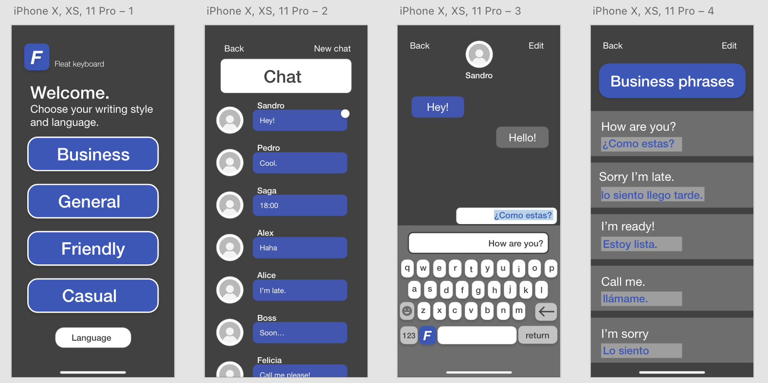
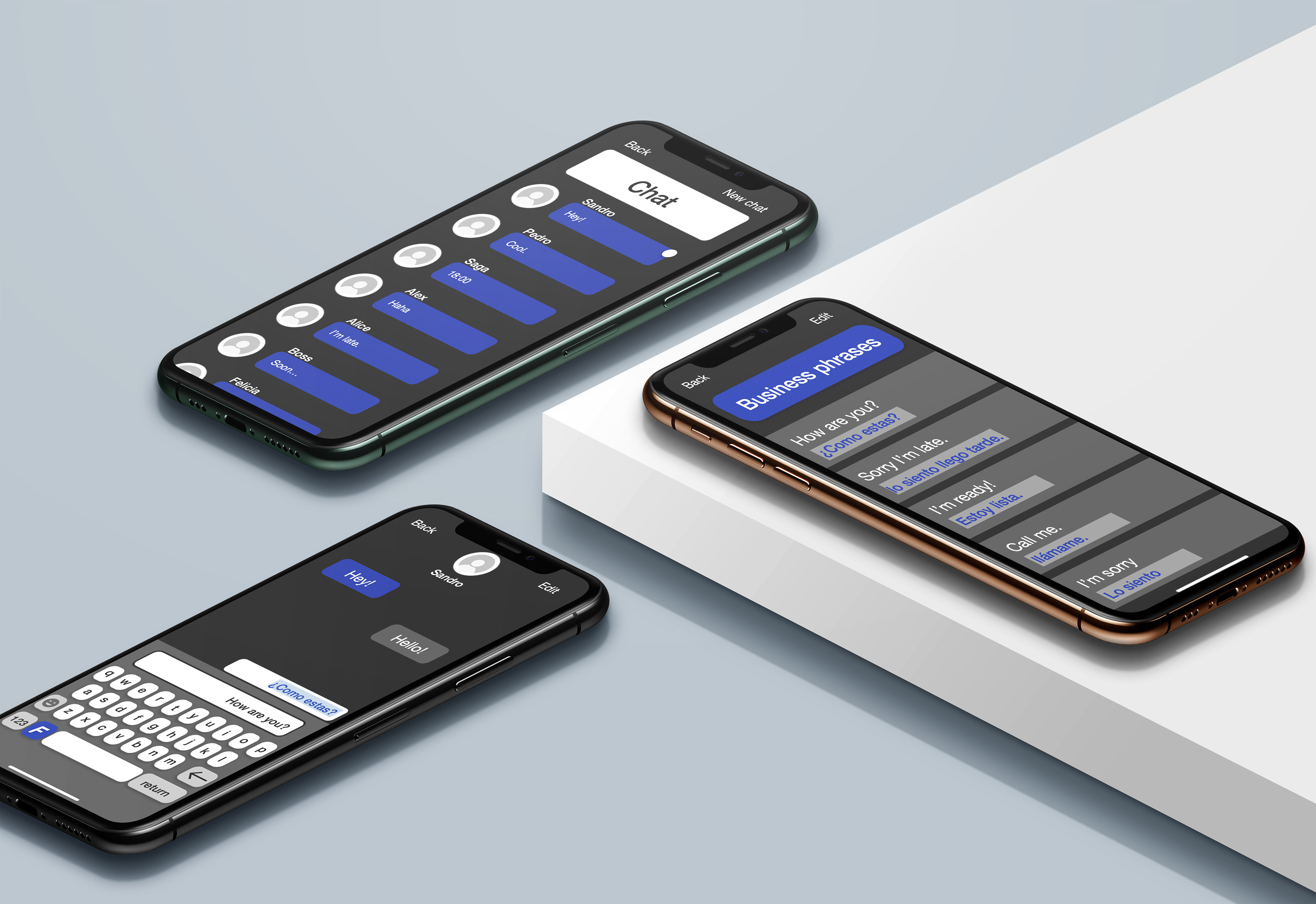
Here you can see the design of the project. The colors create a high contrast to each other and the Helvetica font is easy to read to the eye. Below is a short film showing how the app is used, or the so-called user flow.
GUI MOODBOARD